< Return to main event page

Diocesan Pilgrimage Logo - Symbolism and Meaning
< Return to main event page
The inspiration behind the image:
This year’s logo is inspired by our total dedication to Our Lady of Fatima and the example of Pope St. John Paul II.
The colors of the image:
The colors of the pilgrimage logo are the:
- The blue of Mary
- The gold and white of the papacy
- Purple representing both the regal nature of Our Holy Queen and the penitential posture of penitent pilgrims.
Aspects of the image:
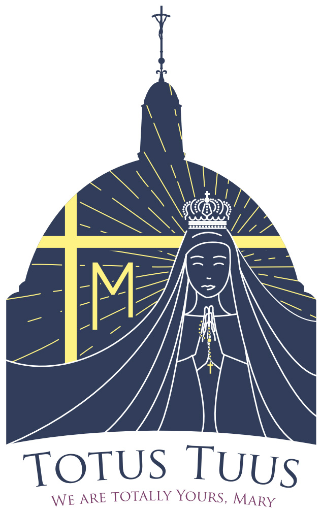
The silhouette of the dome of the National Shrine of the Immaculate Conception invites us into the experience where we will meet Our Blessed Mother.
Mary is seen in the image praying the rosary, hands folded in prayer like a mother folds her hands while teaching her children. She is depicted crowned in royal majesty to show that, while Mother, she is also Queen of Heaven and Earth and due our love and total dedication.
From behind her radiates the dancing sun, a suggestion of the miraculous event in Fatima 100 years ago this year where thousands saw the sun dance and spiral toward the earth. During this 100 year anniversary of Fatima we are once again drawn as pilgrims to this place of prayer to be together as a united diocesan family for the first time with our new Bishop.
Since Bishop Burbidge was consecrated a bishop under the pontificate of Pope St. John Paul II, we look to this great saint to inspire us to have the love he had for Our Blessed Mother. His papal seal is suggested by the cross with the “M” for Maria underneath it, his famous and always recognizable crosier Cross tops the silhouette of the National Shrine and his motto, “Totus Tuus,” prominently inspires us to make the pilgrimage as one family saying "we are totally yours Mary," not only to the National Shrine of the Immaculate Conception but to the St. John Paul II national shrine as well.
< Return to main event page